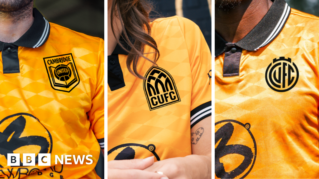
Cambridge United fans will have a say in their club’s new identity

Image source, Cambridge United
- Author, Harriet Heywood
- Role, BBC News, Cambridgeshire
Cambridge United fans can vote on their club’s new crest ahead of an identity change for the 2025/26 season.
Over the course of the year, three different designs were developed based on fan feedback so that supporters can have a say in the direction the club should develop.
CEO Alex Tunbridge said the club believed modernising its crest and identity was “important for growth and development at a time of increasing sporting and financial competition”.
Supporters will have the opportunity to provide feedback during consultation events and an online survey will be launched on 5 August.
Direction One: Evolution
Image source, Cambridge United
Direction One retains some of the key features of the current coat of arms, including the shape and depiction of the Magdalene Bridge.
Instead of the initials ‘CU’, the full initials ‘CUFC’ are displayed front centre and the monogram style is a nod to the club’s original crest – the Abbey United shield.
Designer Chris Payne said: “We worked really hard to retain the key features of the existing design, such as the bridge and turrets, as well as the basic shape of the crest.”
“We also saw this as an opportunity to remove some features of the current design that perhaps don’t work so well in today’s modern age, such as the 1980s football, the small banner at the bottom of the crest and the CU lettering, which we understand is offensive in some languages.
“As part of the identity evolution, we are simplifying the design and reintroducing the club’s full initials, CUFC.”
Direction Two: Abbey Inspired
Image source, Cambridge United
The origins of Cambridge United lie in Abbey United, the name of the club from 1912 to 1948, which is believed to have come from the Abbey Church on Newmarket Road.
Direction Two aims to celebrate the club’s origins and former name by incorporating elements of the Abbey and Cambridge city centre architecture into the badge.
Mr Payne said Direction Two was designed for fans who wanted a bold new identity.
“The Abbey Inspired design is highly unique, but its inspiration is rooted in the early days of Cambridge United,” he said.
“I spent a lot of time in Cambridge researching this project and one of the first things I noticed was the abundance of these arched shapes.
“You only have to spend five minutes in Cambridge city centre and you will see this arched shape everywhere, from iconic buildings and bridges to arched windows and doorways. This shape is an essential part of Cambridge’s identity.”
Direction Three: Book and Ball
Image source, Cambridge United
Direction Three is a more traditional design with balance, symmetry and simplicity, incorporating all the design elements of the classic shield.
This design offers an option for fans who want a more traditional crest and the return of the book and ball.
Mr Payne said they wanted to offer fans a more traditional design alongside the more abstract Directions One and Two.
He said: “The book and ball is such an interesting idea and concept that is nothing new to Cambridge United fans. We have spent a long time looking at the book and ball design from the 1970s and tried to reinterpret it.
“Similar to Direction Two, the strength of this design lies in its story.
“The book and the ball provide a link to past identities, as well as to the rules of football formalized at Cambridge. It is also a subtle nod to Cambridge’s prestigious educational system.”
Mr Tunbridge encouraged fans to voice their opinions.
“We believe that modernising our crest and identity is important for our growth and development at a time of increasing sporting and financial competition,” he said.
“We also all recognise that this is a sensitive issue and one that people understandably have strong opinions about, so our starting point has always been to do this in full cooperation with the fans.”
“That is why we did not push through the proposed new draft this time last year.”
Image source, Cambridge United


